Designing "Project Feed Page" to Increase User Engagement on the BRIDGEGOOD Platform
bridgegood.com/explore
BRIDGEGOOD
Search creatives, projects, events
ExploreDashboardChatK
Welcome back
Hello, Kaitlyn
See what's going on in the BRIDGEGOOD community
Timeline
VIP EventsUpcoming events
MC
Maya Chen is attending an Event
Join
DO
Daniel Okafor is attending an Event
Join
PR
Priya Raman is signed up for an Open Lab
Join
View all upcoming events →
Recent ActivityBG community
LM
Leo Martins followed Amara Diallo
Follow
SR
Sofia Reyes followed Nick Wood
Follow
JK
Jonah Kim followed Andreea Elliot
Follow
Explore the BG community →
People you followSee all
Wireframes
NW
Nick WoodProduct Designer
24 61h ago
Icon set
AE
Andreea ElliotVisual Designer
41 129h ago
Case study
SV
Sara VargasUX Researcher
18 31d ago
Role
UI/UX Designer
Team
3 Designers
Tools
Figma, Miro, Pen & Paper
Duration
1 Week
1Research
2Define
3Ideate
4Test & Iterate
5Design
About
BRIDGEGOOD is a nonprofit design studio primarily funded by Google.org to empower designers through hands-on, inclusive design education.
The organization is committed to helping underrepresented designers launch their careers in design and tech, offering hands-on learning experiences with a focus on diversity, inclusivity, and accessibility.
Problem Statement
One of the biggest concerns for BRIDGEGOOD product owners was the low user engagement after account creation. While many users enjoyed the platform's features, they struggled to stay connected.
The users expressed:
The lack of engagement negatively impacted their overall experience. After gathering similar insights from both product owners and users, we defined our problem statement: "Although many users take advantage of features like portfolios and free events, they struggle to build meaningful connections."
Research
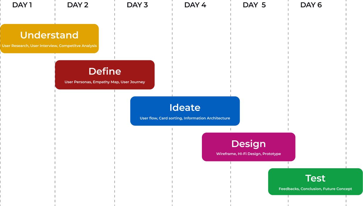
Design Timeline
Over the course of 6 days, I collaborated closely with 3 UX designers in an intensive design sprint, rapidly ideating, prototyping, and refining solutions to tackle the project's core challenges.
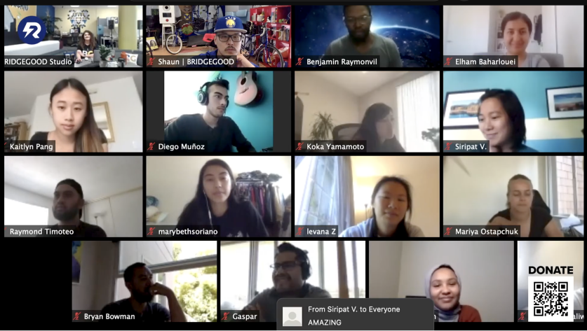
To better understand the challenges within the organization and website, we had a lightning talk with program leads and stakeholders. We found out that most users learn about the platform through BRIDGEGOOD staff who visit classrooms to connect with students. However, most users stop engaging with the platform after uploading a few projects to their portfolios. The few users who stay engaged do so through in-person or Zoom workshops with the organization. More importantly, many users seem to struggle with finding ways to stay involved or make meaningful connections after their initial use, causing a drop in platform activity.
Interview
We conducted 6 user interviews with new and existing BRIDGEGOOD users to understand what they value and where they encounter challenges. Using an 8 question interview guide, we focused on users' motivations and expectations. Below are the key insights.
During the research phase of the project, we conducted 6 user interviews with new and current BRIDGEGOOD users to understand what users enjoy about the platform as well as their common pain points. Together with the team, we prepared an interview script with 8 open-ended questions, focusing on our target audience's values, motivations, and business expectations. Here are the key findings after the research:
Lack of Ongoing Engagement Opportunities
Users enjoyed the platform's features but struggled to stay engaged after setting up their portfolios, wanting more ways to interact regularly.
Desire for Meaningful Connections and Feedback
Users found it difficult to connect with peers who could provide valuable feedback and insights.
Limited Community Interaction
The lack of interactive features made it hard for users to feel part of a creative community, making it difficult to build connections and stay motivated.
Define
Persona
To better understand user goals and behaviors, we created our user persona, Amara, based on interview insights, and refined it as new data emerged. This persona helped keep the team aligned and focused on real user needs throughout the project.
User Journey
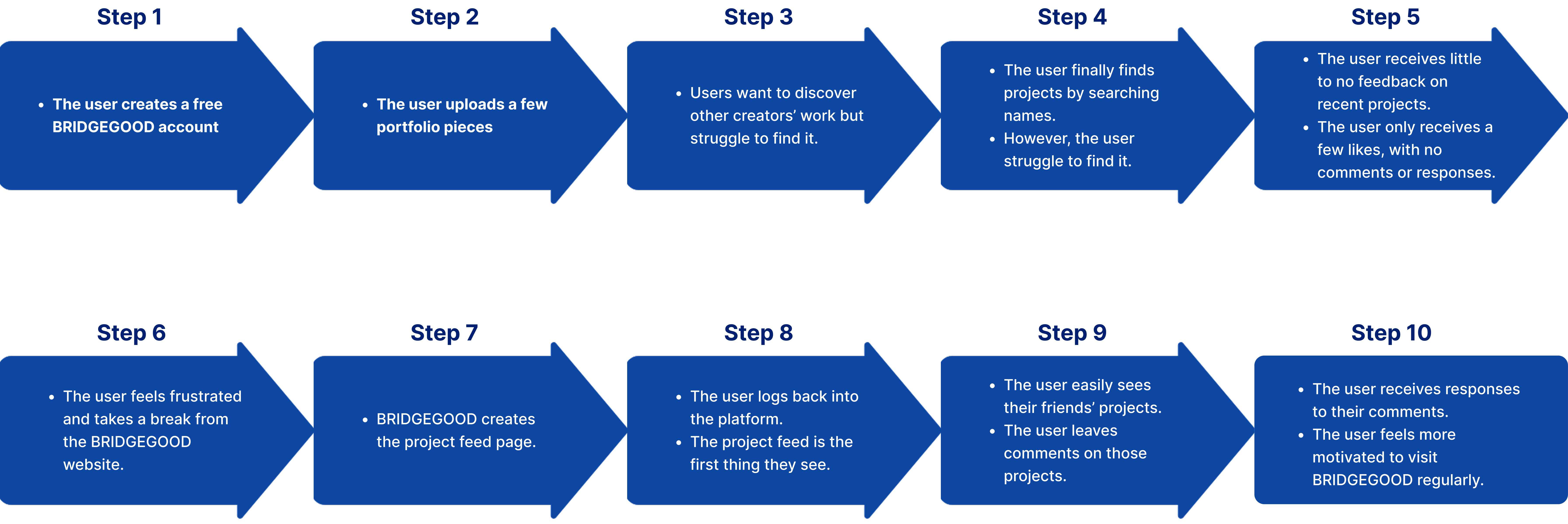
We mapped the end-to-end journey of BRIDGEGOOD creators, from building and sharing portfolios to connecting with peers, mentors, and feedback opportunities. This process helped us understand how users interact with the platform and identify key areas for improvement.
Define
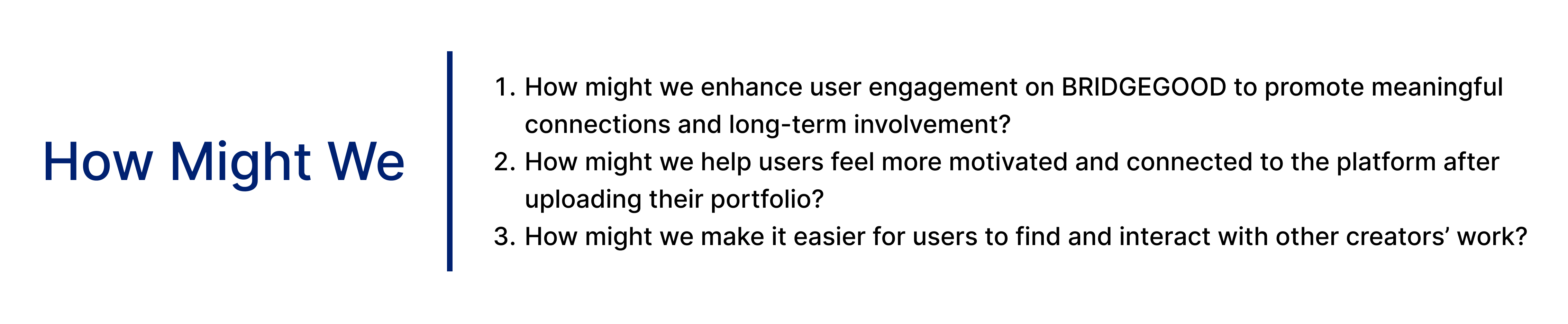
To uncover opportunities and translate user insights into actionable design challenges, we developed several "How might we" statements.
Information Architect
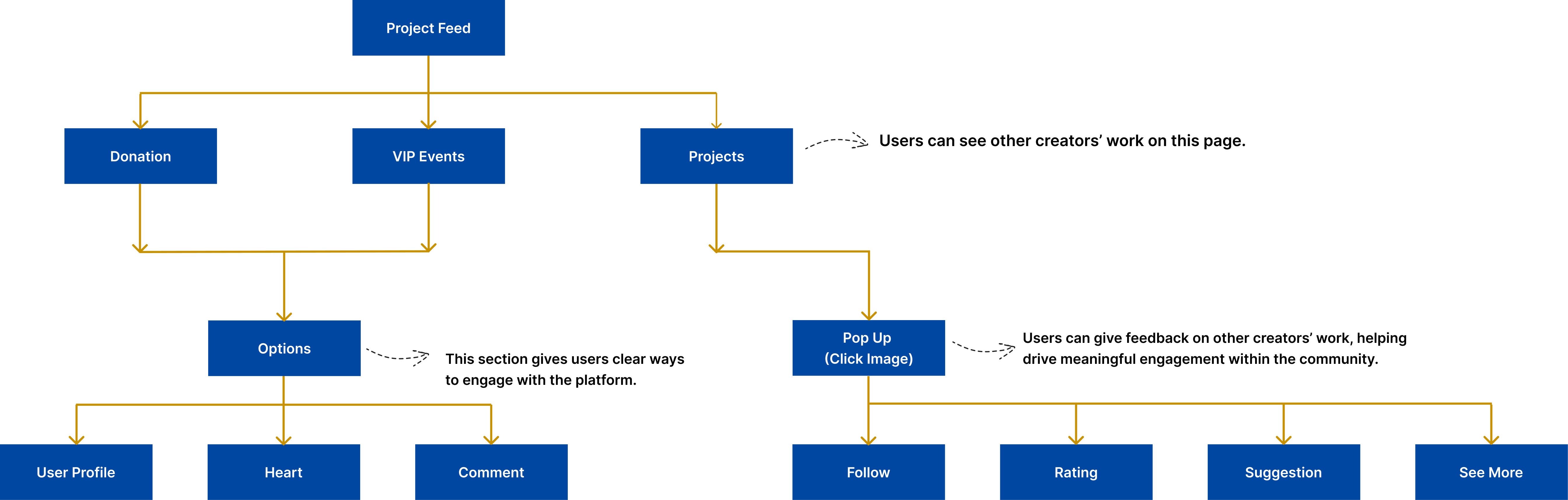
With a clear understanding of the user's needs, our team created a site map to visualize the hierarchy of information and how users navigate to the project feed page.
Ideate
Sketch & Wireframes
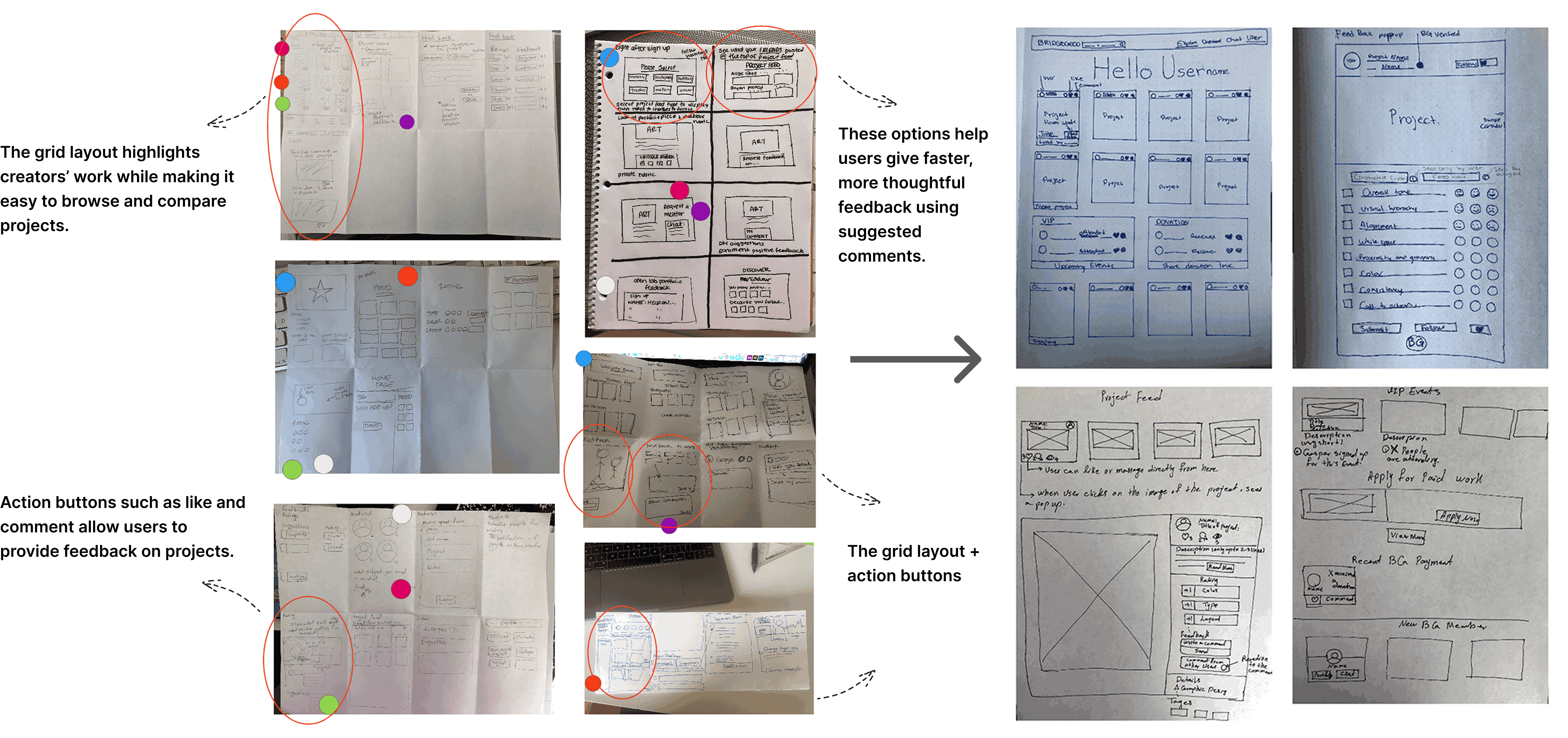
We collaborated as a team to rapidly generate ideas and used dot voting to prioritize them. The strongest concepts were then translated into wireframes.
Test & Iterate
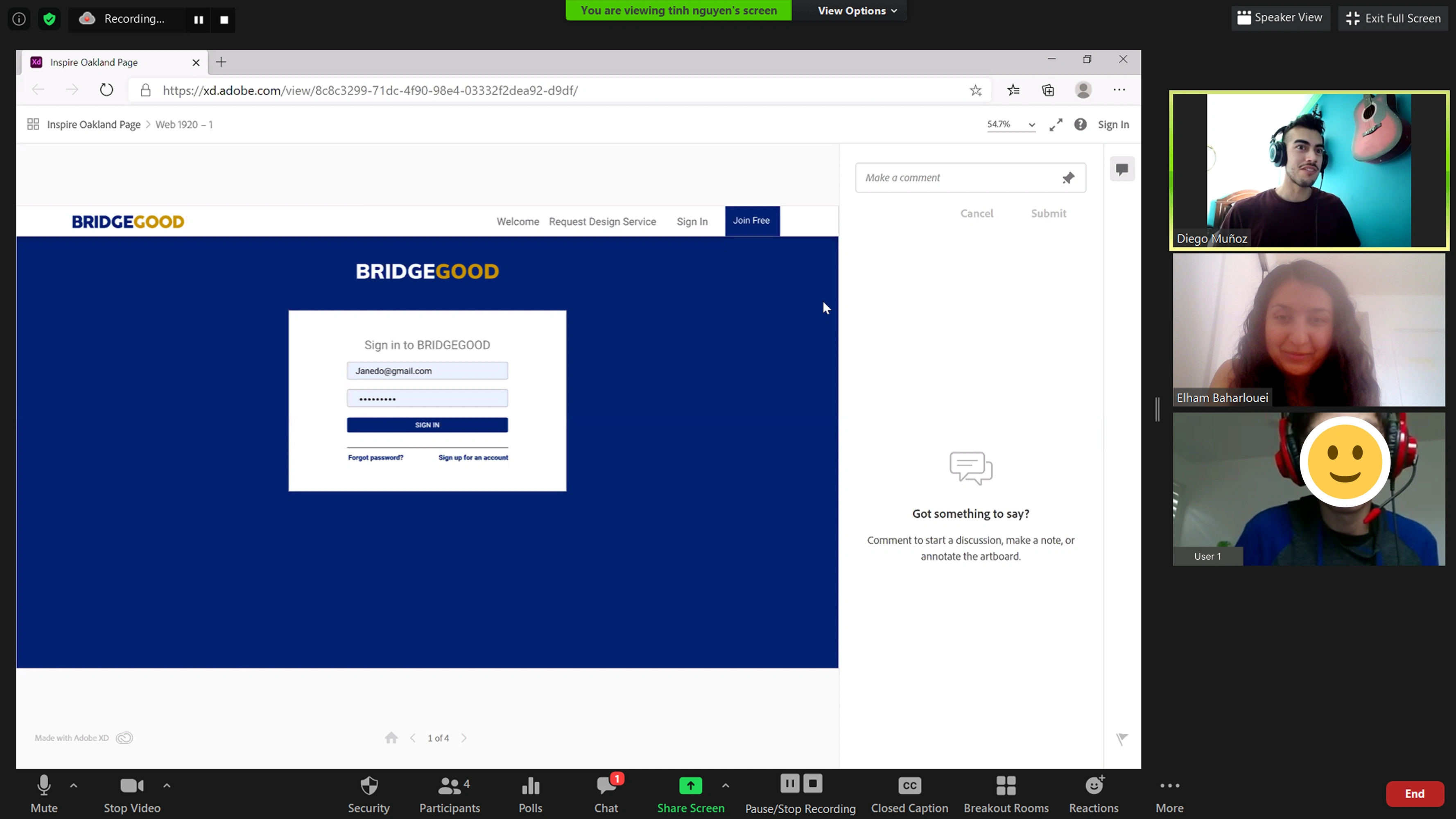
User Testing
6 current users were interviewed to gather feedback on 2 primary layout options: a grid layout and a single-column layout.
Main Findings
Solutions
Users have difficulty finding new projects that have been uploaded to the platform.
After logging in, users were brought to the project feed page instead of their own dashboard.
Users are sometimes unsure about what feedback to provide on someone else's work.
Rating with pre-filled content was added, along with an "Add Comment" feature so users can write more personalized messages.
Users would like to see activities from other creators as well and make more meaningful connections.
Two sections were created: activities such as events, workshops, and following other creators.
Users prefer to see more projects in one scroll.
Two layout versions were created: single-column and grid layout. Users preferred the grid layout as it allowed them to see more projects with one scroll.
Design
UI Design
After conducting research, brainstorming, and sketching, we decided to focus on designing 3 core pages:
→A Project Feed: to surface new creator work and community activity.
→VIP Events: to help users discover and join relevant events.
→A Feedback-on-Project flow: enables creators to easily rate, comment on, and connect with one another.
BRIDGEGOOD
Search creatives, projects, events
ExploreDashboardChatK
Welcome back
Hello, Kaitlyn
See what's going on in the BRIDGEGOOD community
Timeline
VIP EventsUpcoming events
MC
Maya Chen is attending an Event
Join
DO
Daniel Okafor is attending an Event
Join
PR
Priya Raman is signed up for an Open Lab
Join
View all upcoming events →
Recent ActivityBG community
LM
Leo Martins followed Amara Diallo
Follow
SR
Sofia Reyes followed Nick Wood
Follow
JK
Jonah Kim followed Andreea Elliot
Follow
Explore the BG community →
People you followSee all
Wireframes
NW
Nick WoodProduct Designer
24 61h ago
Icon set
AE
Andreea ElliotVisual Designer
41 129h ago
Case study
SV
Sara VargasUX Researcher
18 31d ago
Project Feed Page
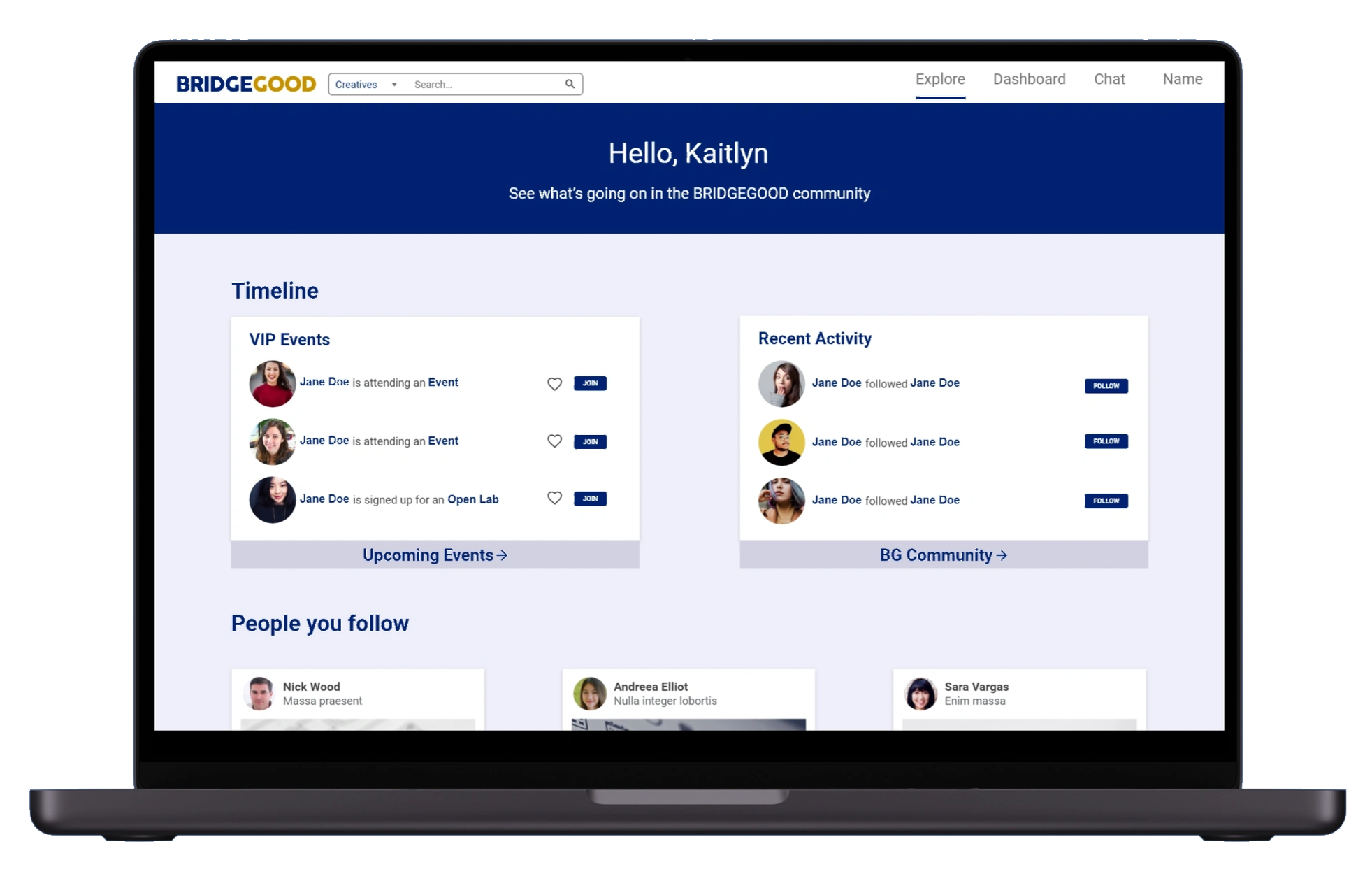
The Explore tab highlights new projects, VIP events, and recent community activity. Users can quickly see friends' work, react with likes and comments, and discover new creators to connect.
bridgegood.com/explore
BRIDGEGOOD
Search creatives, projects, events
ExploreDashboardChatK
Welcome back
Hello, Kaitlyn
See what's going on in the BRIDGEGOOD community
Timeline
VIP EventsUpcoming events
MC
Maya Chen is attending an Event
Join
DO
Daniel Okafor is attending an Event
Join
PR
Priya Raman is signed up for an Open Lab
Join
View all upcoming events →
Recent ActivityBG community
LM
Leo Martins followed Amara Diallo
Follow
SR
Sofia Reyes followed Nick Wood
Follow
JK
Jonah Kim followed Andreea Elliot
Follow
Explore the BG community →
People you followSee all
Wireframes
NW
Nick WoodProduct Designer
24 61h ago
Icon set
AE
Andreea ElliotVisual Designer
41 129h ago
Case study
SV
Sara VargasUX Researcher
18 31d ago
Explore TabUsers will be taken to the project feed page after logging into their account instead of their portfolio dashboard. They will have the opportunity to see newly added projects from other creators, creating more opportunities to engage with the platform and interact with other creators' work.
VIP Events & Recent ActivityThe VIP events and recent activity section was moved to the top of the page after user testing. Users can see what events their friends or other creators are attending, making it easier for them to join. The recent activity section shows other BG community activities, giving users a chance to expand their network, follow other creators, and build meaningful connections.
Project Feed Page
The People You Follow section shows friends' recent work in a grid layout, while love, comment, and discover features let users react to projects and connect with new creators.
bridgegood.com/projects
People you followSee all
DiscoverSee more creators
People You FollowThe People You Follow section displays users' friends' recent works. Users preferred a grid layout over a single-column layout as it allows them to see more projects with one scroll.
Love & CommentUsers can directly react to other creators' projects with likes and comments.
DiscoverUsers can make new connections and learn about other creators.
VIP Events
VIP Events lets users view event details and join events with a single click.
bridgegood.com/explore
BRIDGEGOOD
Search creatives, projects, events
ExploreDashboardChatK
Welcome back
Hello, Kaitlyn
See what's going on in the BRIDGEGOOD community
Timeline
VIP EventsUpcoming events
MC
Maya Chen is attending an Event
Join
DO
Daniel Okafor is attending an Event
Join
PR
Priya Raman is signed up for an Open Lab
Join
View all upcoming events →
Recent ActivityBG community
LM
Leo Martins followed Amara Diallo
Follow
SR
Sofia Reyes followed Nick Wood
Follow
JK
Jonah Kim followed Andreea Elliot
Follow
Explore the BG community →
People you followSee all
Wireframes
NW
Nick WoodProduct Designer
24 61h ago
Icon set
AE
Andreea ElliotVisual Designer
41 129h ago
Case study
SV
Sara VargasUX Researcher
18 31d ago
bridgegood.com/explore
BRIDGEGOOD
Search creatives, projects, events
ExploreDashboardChatK
Welcome back
Hello, Kaitlyn
See what's going on in the BRIDGEGOOD community
Timeline
VIP EventsUpcoming events
MC
Maya Chen is attending an Event
Join
DO
Daniel Okafor is attending an Event
Join
PR
Priya Raman is signed up for an Open Lab
Join
View all upcoming events →
Recent ActivityBG community
LM
Leo Martins followed Amara Diallo
Follow
SR
Sofia Reyes followed Nick Wood
Follow
JK
Jonah Kim followed Andreea Elliot
Follow
Explore the BG community →
People you followSee all
Wireframes
NW
Nick WoodProduct Designer
24 61h ago
Icon set
AE
Andreea ElliotVisual Designer
41 129h ago
Case study
SV
Sara VargasUX Researcher
18 31d ago
GOOGLE PLAY: CHANGE THE GAME
Exclusive BRIDGEGOOD Opportunity
BRIDGEGOOD.com/company/bridgegood
BG
Date:
July 30, 2020
Time:
4:00 pm - 5:00 pm
Address:
Virtual (Online)
+ Google Calendar
MCDOPRJKLMSRNWAE
Seats Available (20)
Details:
Share on
For designers under the age of 18, submit your idea for a mobile game to Google. Use what inspires you, get creative & win prizes. View link!
VIP EventsUsers can quickly see key details like date, time, location, and attendees to engage with relevant events.
Project Feed Page
Feedback on Project displays project details in a pop-up, allowing users to follow or message the creator, rate strengths like colors and layout, and leave detailed comments to encourage engagement.
bridgegood.com/explore
BRIDGEGOOD
Search creatives, projects, events
ExploreDashboardChatK
Welcome back
Hello, Kaitlyn
See what's going on in the BRIDGEGOOD community
Timeline
VIP EventsUpcoming events
MC
Maya Chen is attending an Event
Join
DO
Daniel Okafor is attending an Event
Join
PR
Priya Raman is signed up for an Open Lab
Join
View all upcoming events →
Recent ActivityBG community
LM
Leo Martins followed Amara Diallo
Follow
SR
Sofia Reyes followed Nick Wood
Follow
JK
Jonah Kim followed Andreea Elliot
Follow
Explore the BG community →
People you followSee all
Wireframes
NW
Nick WoodProduct Designer
24 61h ago
Icon set
AE
Andreea ElliotVisual Designer
41 129h ago
Case study
SV
Sara VargasUX Researcher
18 31d ago
Visual
JC
Jonathan ClarkWeb Developer
33 52d ago
Data viz
CJ
Christine JacksonUX / UI Designer
27 42d ago
Motion
MC
Maya ChenIllustrator
19 23d ago
JS
Jane SmithFollowMessage
Project 56
Description
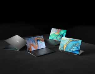
A product shoot for a new laptop line, lit low and moody so the screens carry the colour. Three angles, one surface, shot to show the thin profile and the display.
See more
Comments 6
DS
Diane Sullivan1d
Great choice of colours!
Like · 3Reply
JS
Jane SmithCreator1d
Thank you! Is there good contrast?
MO
Marcus Owens2d
Wow!
LikeReply
AL
Ana Lopez2d
Love the lighting.
Like · 1Reply
TR
Tom Reid3d
Very clean.
LikeReply
KN
Kira Nash4d
Great job
LikeReply
KAdd a comment...Comment
Rate this project
6Colors+1MCDOPR
6Typography+1JKLM
6Layout+1SRNWAE
0Elements+1
6Style+1MC
2Impact+1PRDO
Tags
LaptopStill LifeFlowersStill LifeTechMock up
DETAILS
Graphic Design
Camera
Feedback on ProjectAfter clicking on a project card, a pop-up appears displaying project details such as the name, creator, description, and feedback from other users. Users can also follow or message the creator through this page, encouraging more engagement.
Other creators can rate the project's strengths, such as colors, layout, etc allowing users to quickly and easily provide feedback. Additionally, they can write more detailed, personalized comments if they choose to.
Impact & Metrics
More than 7,000 students from 51 Bay Area schools are now showcasing their work on the platform, enhancing their visibility and attracting potential employers, making a substantial impact on underrepresented creatives.
23% Boost
Platform engagement within 2 months of the redesign.
18% Increase
User sign-ups and portfolio creations.
15% Rise
User satisfaction, as indicated by feedback surveys.
What I Learned
Designing BRIDGEGOOD required early stakeholder involvement, ongoing user testing, and close collaboration with engineers to ensure technical feasibility. Working within a one-week timeline pushed us to adopt a lean approach focused on prioritization, rapid validation, and continuous feedback.
Early Feedback
Engaging stakeholders early and testing with users helped refine the design and improve the overall experience.
Real-World Constraints
Designing for BRIDGEGOOD meant considering technical limits and working closely with engineers to ensure feasibility.
Rapid Design
Designing a feature in just one week meant taking a lean approach; prioritizing the most important functionality, testing ideas quickly, and iterating based on feedback.
Next Steps
Ongoing user testing and post-launch feedback to identify pain points, measure engagement, and inform feature improvements.
 Wireframes
 Icon set
 Case study
.svg)

.svg)