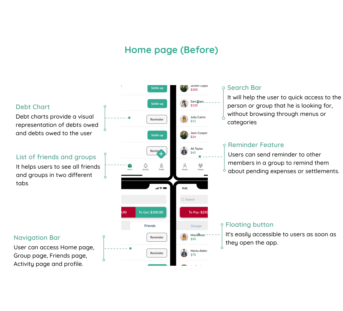
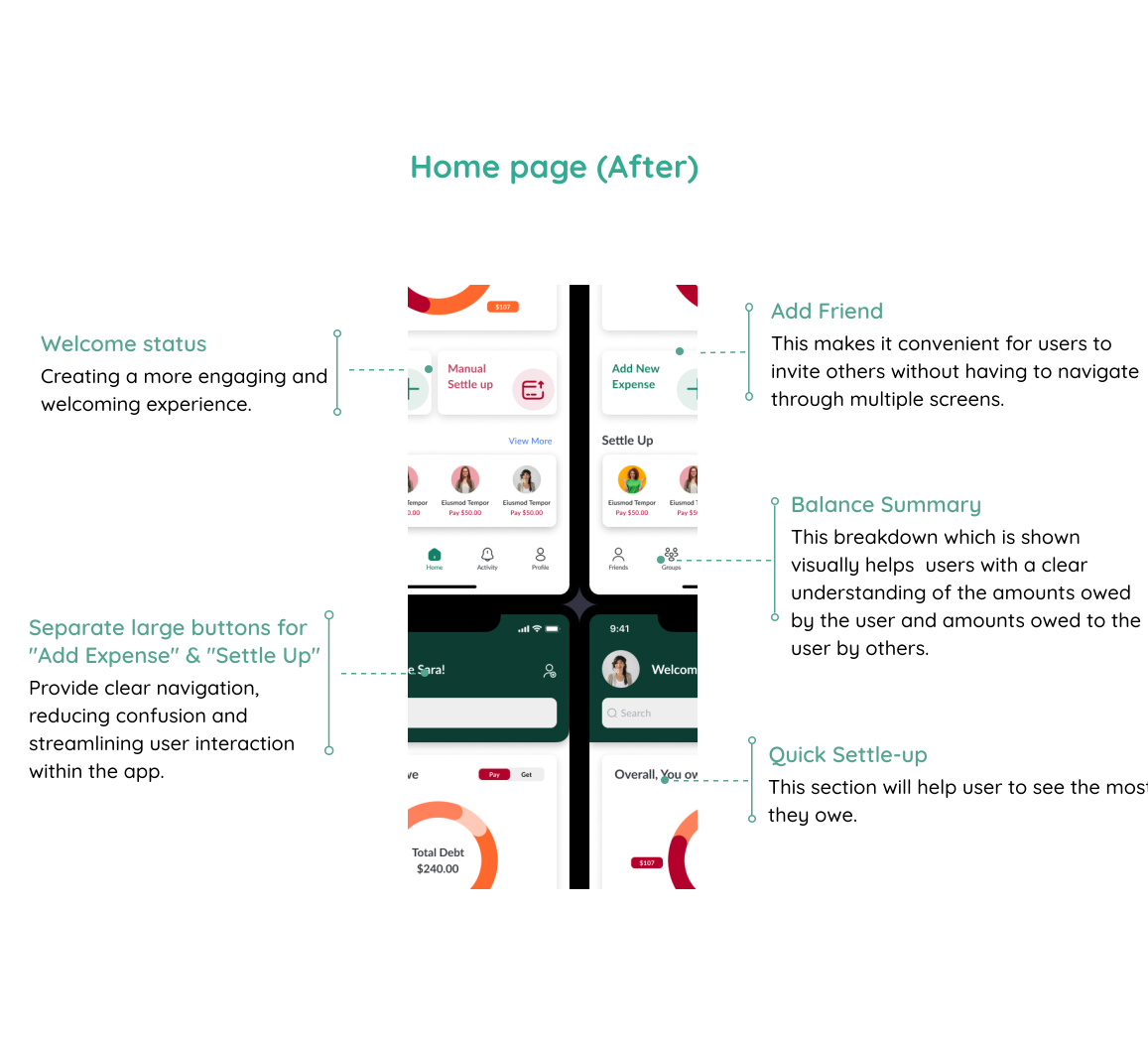
Simplifying "Add Expense" and "Settle Up": the two flows driving frustrated users toward simpler alternatives
Product
Splitwise
Focus
Add Expense · Settle Up
Method
Survey, Interview, Testing
Users Studied
26+ surveyed, 6 interviewed
Project Overview
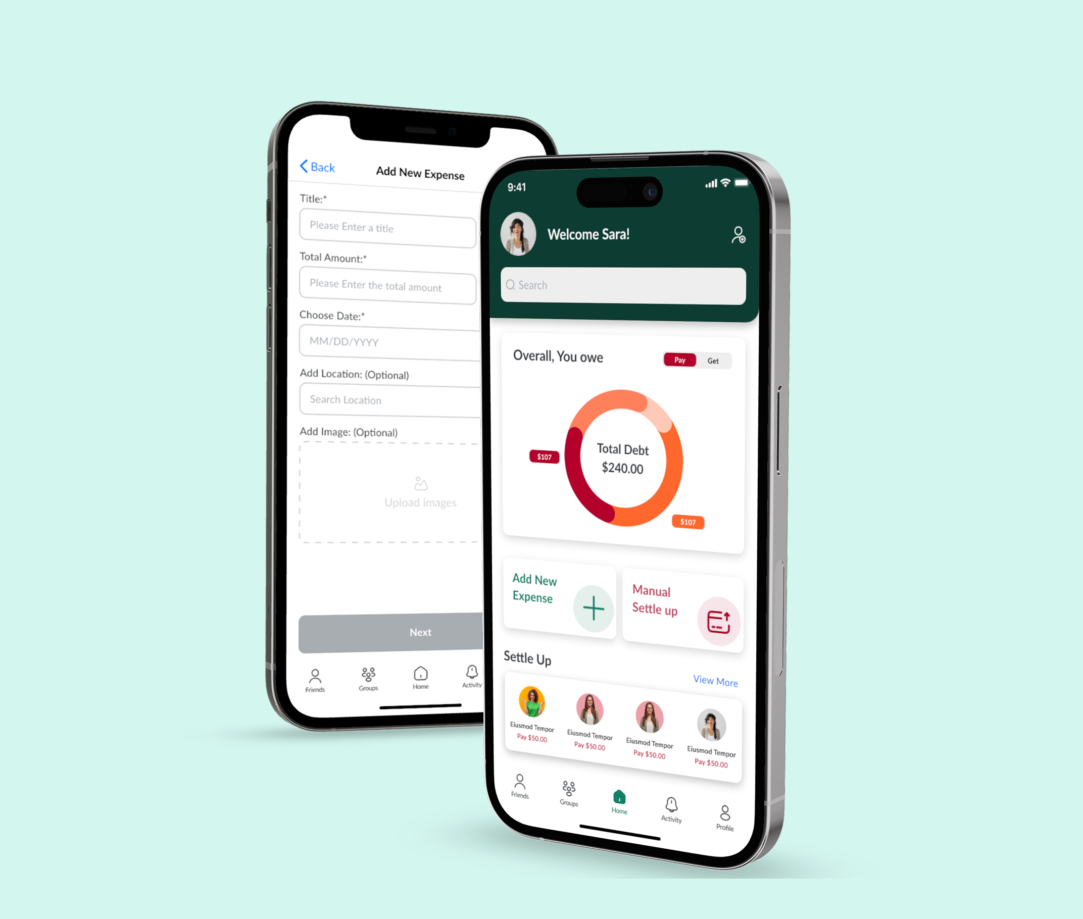
Splitwise is a mobile app that allows users to split expenses with friends. This project focused on improving the user experience and interface of the application by redesigning two of its main features.
As a group of friends using the Splitwise app, we faced some challenges. We wondered if these issues were only happening to us or if other users were facing the same problems. After checking reviews on both the App Store and Google Play, we found out that many users had similar difficulties. Since we're from a similar background and passionate about solving problems as UX designers, we decided to redesign the app as a passion project.

The Problem Statement
Users find Splitwise's "Settle Up" and "Expense Entry" features confusing and inefficient, leading to delays and frustration. These usability issues often drive users to look for easier expense-sharing alternatives.
Splitwise is a popular app that helps friends split and track shared expenses, but many users find the "Settle Up" and "Expense Entry" features confusing and hard to use. The unclear workflows and tricky navigation often lead to delays in settling debts and frustration when adding new expenses, pushing some users to seek simpler alternatives.
Solution
To address this, the idea is to simplify the "Add Expense" flow and redesign the "Settle Up" to be more intuitive and straightforward. By improving overall clarity and creating a more approachable interface, Splitwise can reduce user frustration and make expense sharing feel seamless and stress-free.
Making the "adding new expense" flow simpler and more understandable
Create a clear settle-up experience with less confusion
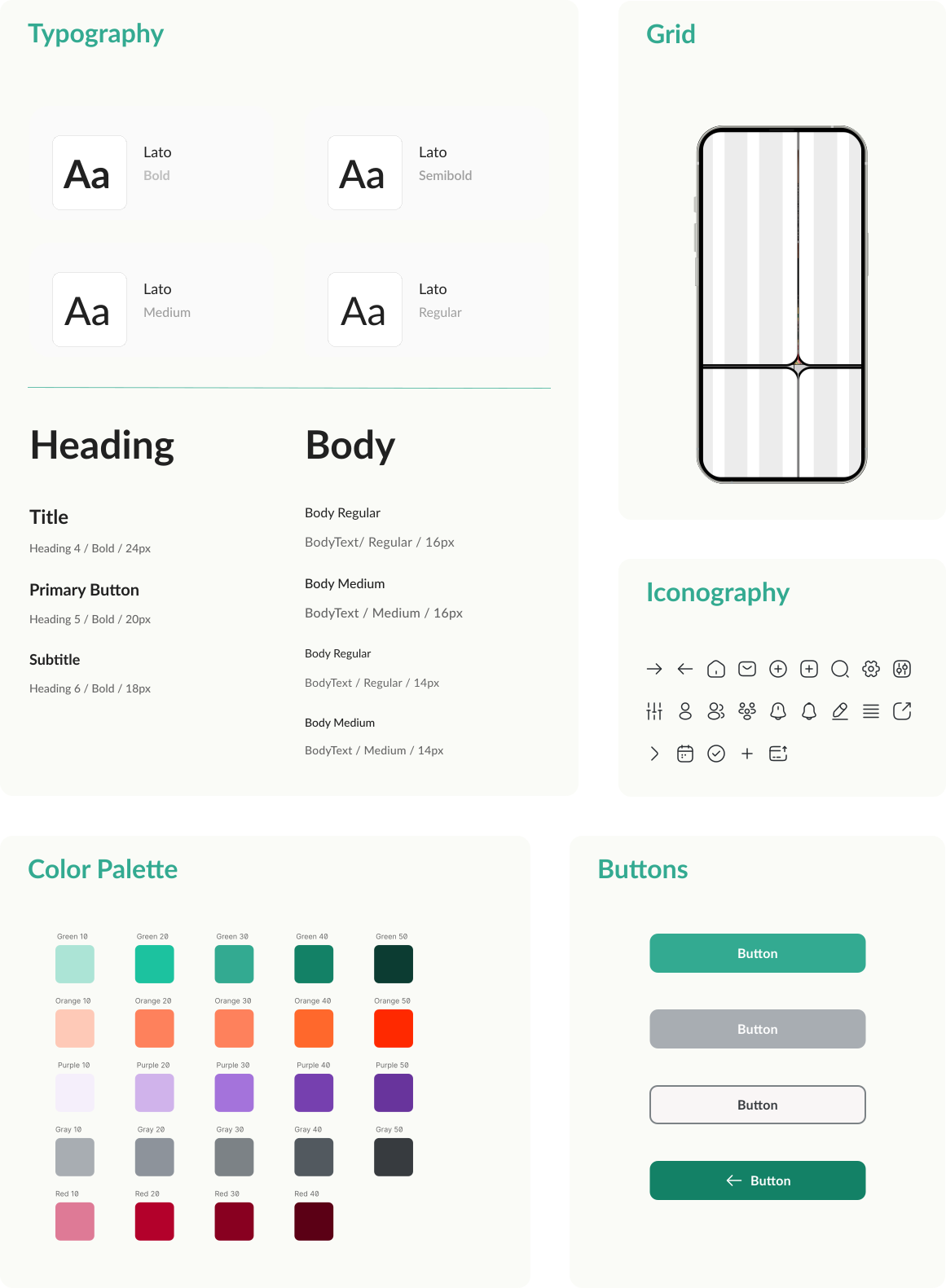
Enhancing overall clarity by creating a user-friendly interface
Design Process
.png)
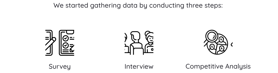
To dig deeper into user difficulties, we conducted a quantitative survey with 26 existing users. The survey included questions covering topics like interest in sharing expenses, frequency of using expense management apps, challenges in splitting shared costs, and preferred methods for receiving app notifications.
For 64% of users, the primary use of the app is adding expenses and settling debts.
40% of users are not satisfied with the settlement process.
57% of users are not satisfied with the process of adding expenses.
Despite criticisms, 96% of users recommend this application.
The survey helped us identify broad responses and common issues that the users
experienced in the process of sharing, splitting, and settling up expenses.
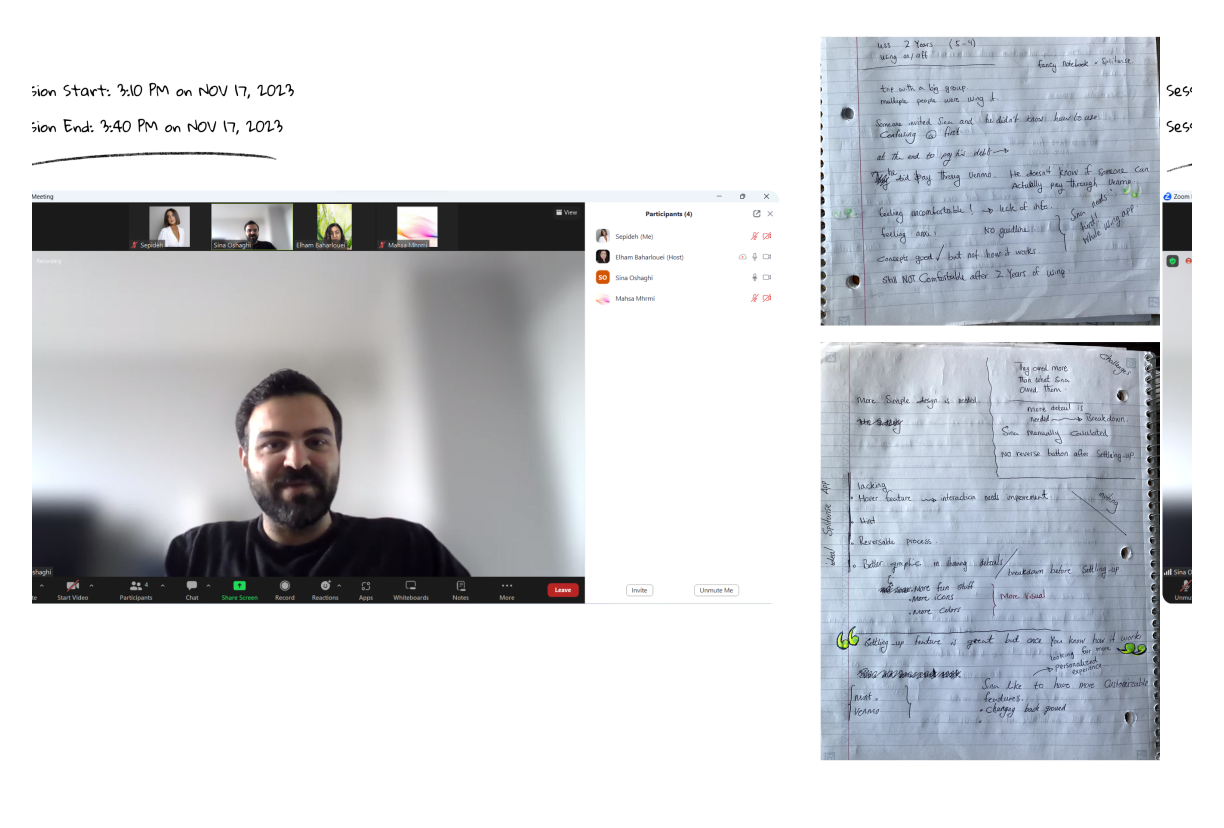
To dive deeper into the problem, we interviewed 6 users who frequently split expenses, rely on Splitwise's free plan, or have switched to alternative apps. These conversations focused on how they manage shared costs and revealed key frustrations with the "Settle Up" and "Add Expense" flows, helping us uncover the root of their confusion.
• It's nice if it can show how much I owe others by a graph.
Participant 1
• Working with the app need lots of data entry and is boring.
Participant 2
• I freaked out when I pushed the settle-up button and I thought I eared everything.
Participant 3
• Inviting new friends to the app is not easy and straightforward.
Participant 4
1 – Confusing "Settle Up" Experience
Users often feel lost when trying to settle balances, as the app doesn't clearly show who owes what, leading to delays and mistakes.
2 – Complicated Expense Entry Process
Manually entering expenses is time-consuming, and splitting costs unequally can be confusing, especially in larger groups.
3 – Poor First-Time Experience
New users struggle with unclear navigation, no onboarding or tutorial, and confusing features like the Friends tab, making the app feel overwhelming from the start.
4 – Lack of Visual Clarity
The interface is seen as dull and cluttered, with poor use of color, icons, and graphs, making it hard to scan information quickly or stay engaged.
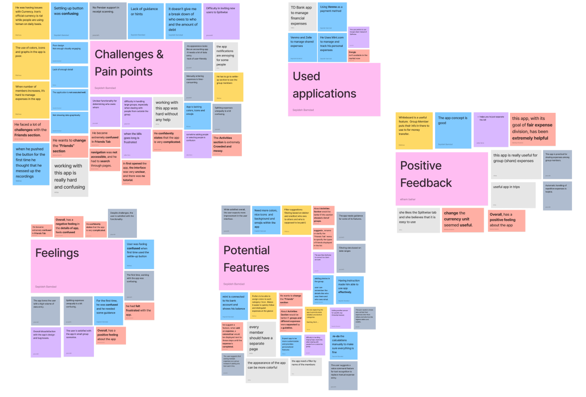
One of the main challenges in our research was analyzing a large volume of qualitative data from interviews and surveys. We used affinity mapping to categorize it and derive actionable findings.
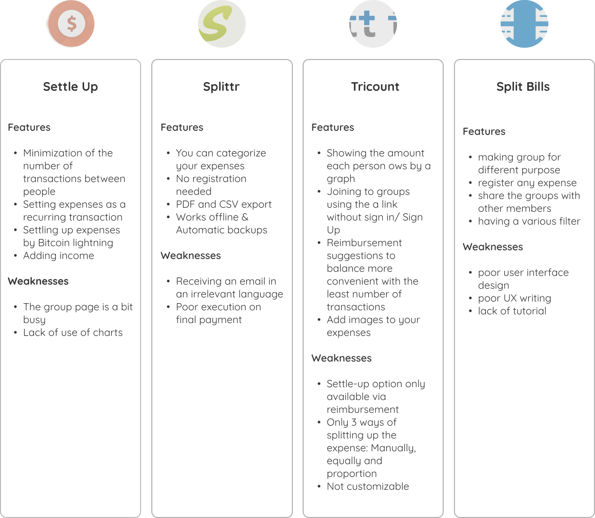
After learning more about our users, we examined Splitwise's competitors, such as Settle Up, Splittr, Tricount, and Split Bills to identify industry standards and gather insights for improving Splitwise.
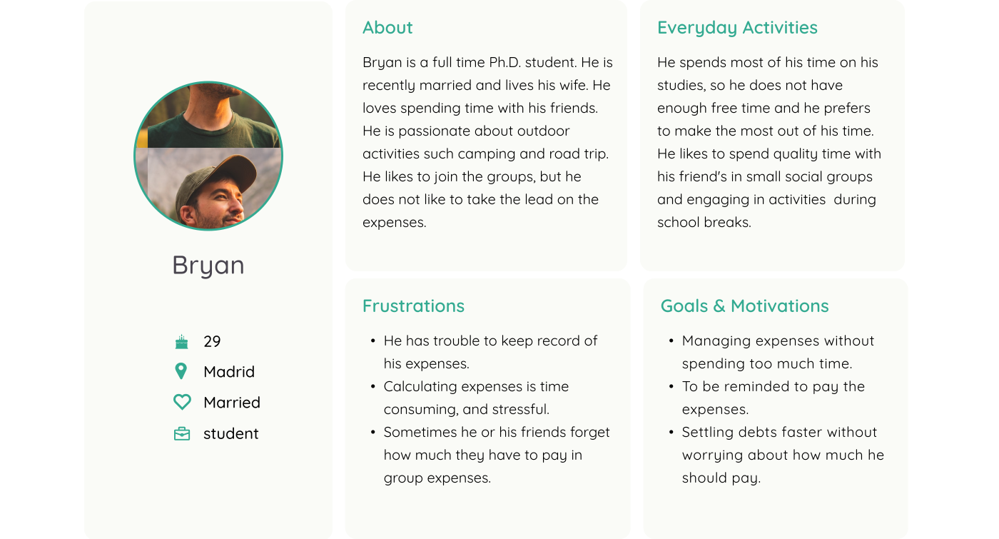
We created two personas as representations of our target users which enables us to better understand user needs, behaviors, and goals.
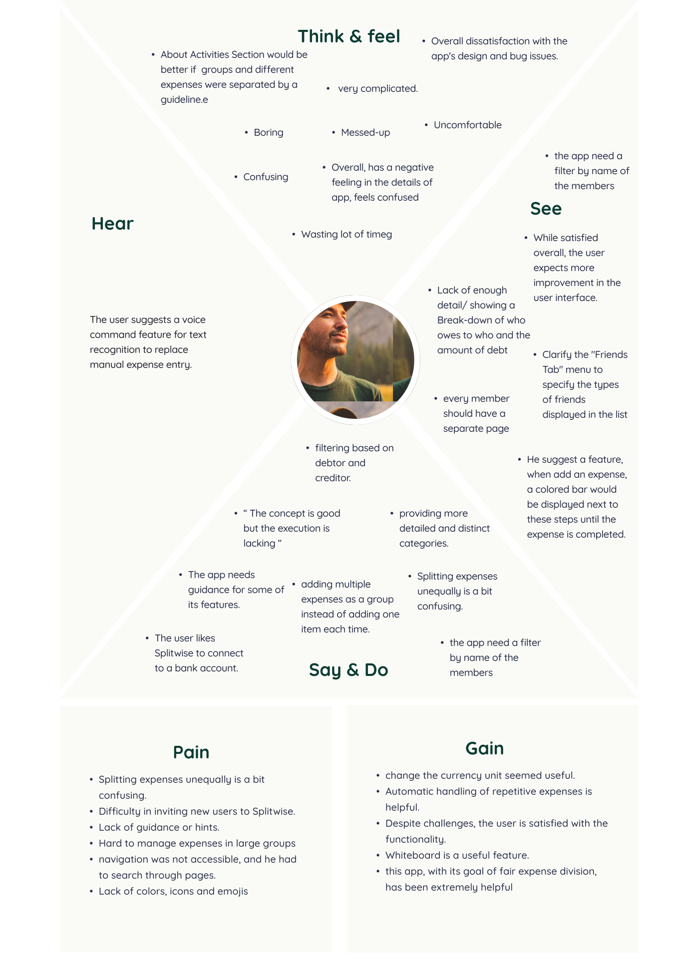
To organize all of the information gathered from the affinity map, we designed an empathy map by writing our findings on sticky notes.
We used Crazy 8's to brainstorm our ideas to address the needs and expectations of users for a shared expenses management app like Splitwise. Then we used the dot voting method to narrow down the ideas.
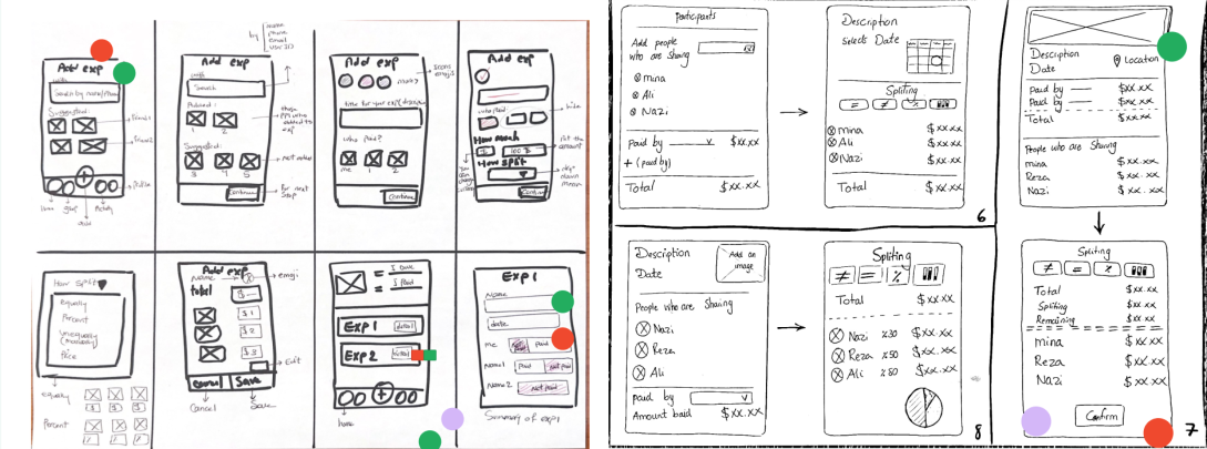
After reviewing our process and data, we identified that the primary challenges users face are centered around the expense entry and settle-up processes, so we decided to focus on the two main flows to continue our process.
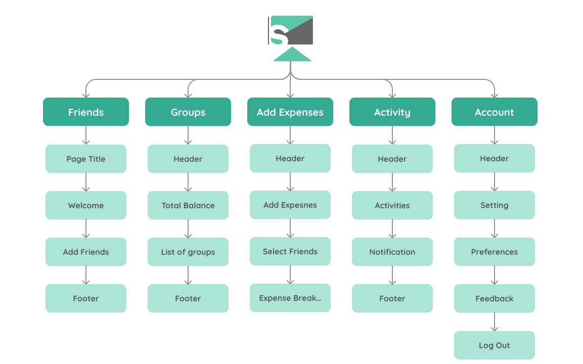
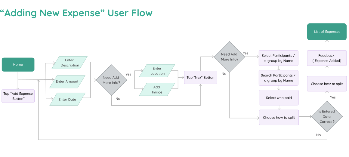
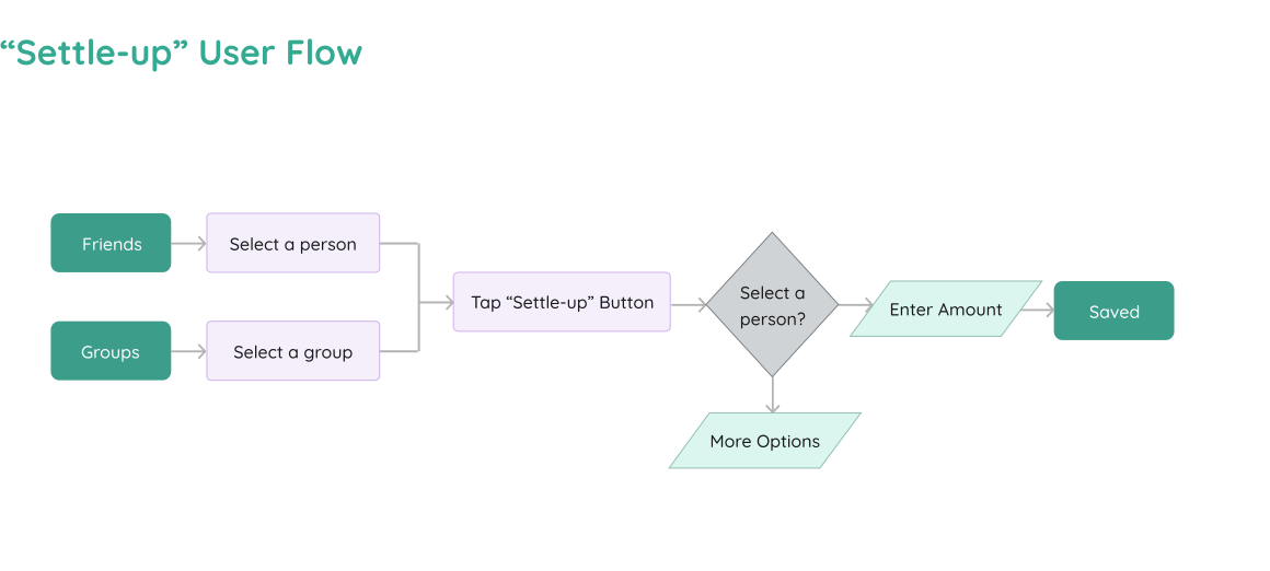
After having a clear understanding of what features we wanted to redesign, our team visualized the user's path, starting from the home page to accomplish "Entering a new expense" or "Settling Up" the previous expenses.
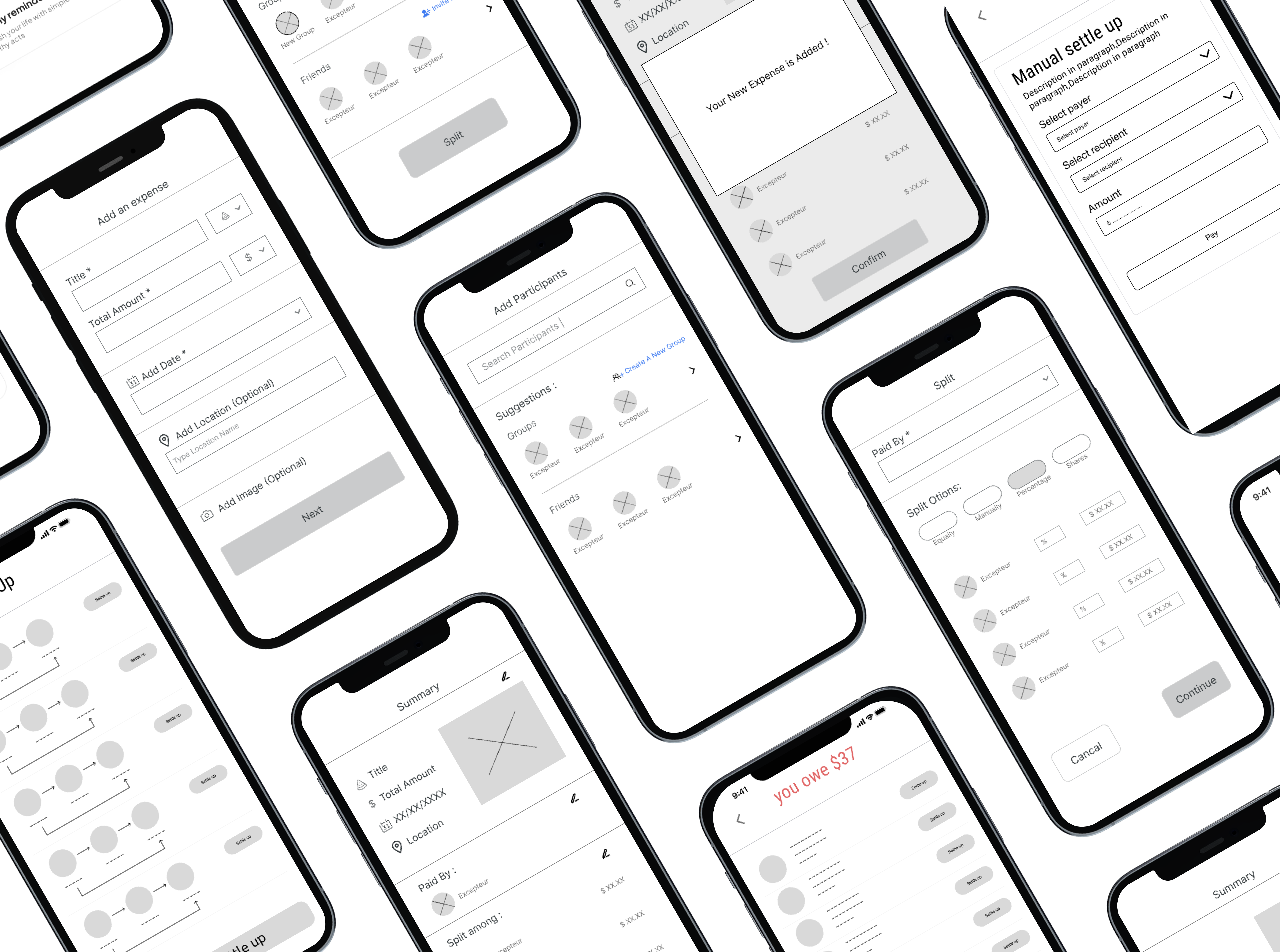
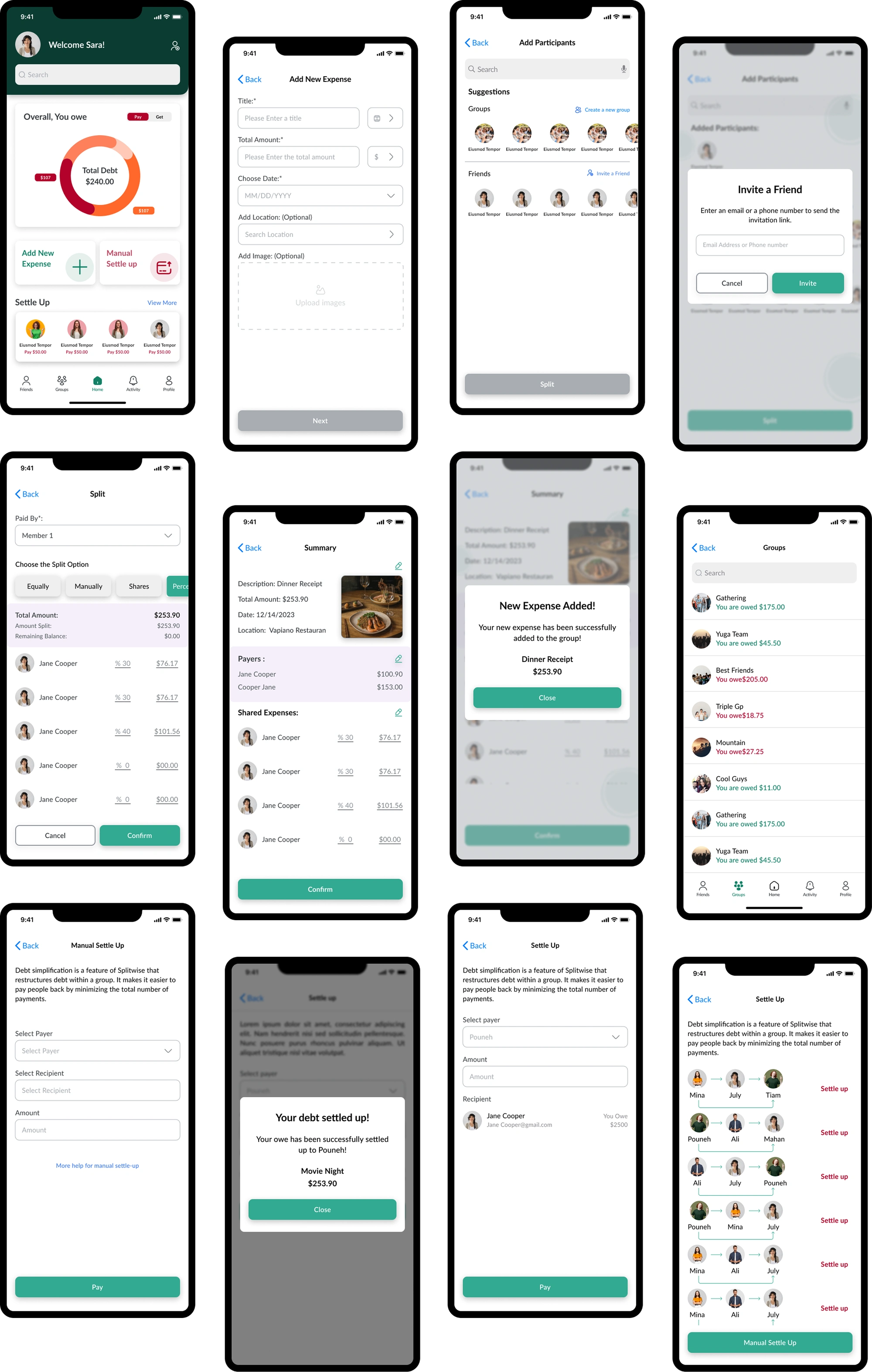
We conducted two types of usability tests at this stage including both moderated and unmoderated sessions. For unmoderated testing, we used "Maze" and moderated, we interviewed 5 participants, consisting of both existing users of the app and new users.