Reducing cart abandonment on Etsy through price transparency and building trust
Role
UI/UX Designer
Team
2 Designers
Duration
5 Weeks
Platform
Web
70%
of online carts are abandoned, per Baymard Institute, and nearly half of those shoppers leave over unexpected costs at checkout.
6
interviews plus social listening pointed to one cause: shoppers left not because prices were high, but because they couldn't tell the final price or trust the seller.
5
A restructured product page, AI authenticity scanner, AI review summary, Etsy Plus membership, and Try Before You Buy, all validated in usability testing.
Background
Etsy is a marketplace built around unique, handmade goods, with 7.5 million active sellers and 95.1 million active buyers. But the checkout experience can create uncertainty. Shoppers encounter unexpected fees, unclear shipping timelines, and limited information about the sellers they are buying from.
Goal
Reduce cart abandonment by making the total cost visible earlier and giving shoppers enough information to trust the seller before they commit.
My role
I worked as one of two designers on this project. I led the research, from the industry study and social listening through six user interviews, and carried it into the personas, the comparative analysis, and the high-fidelity designs for the product page and the trust features.
How might we give shoppers enough clarity about price,
seller, and delivery to complete a purchase with confidence?
I started with five assumptions about what might drive cart abandonment on Etsy: poor customer support, unreliable delivery windows, hidden costs, lack of trust, and a confusing checkout.
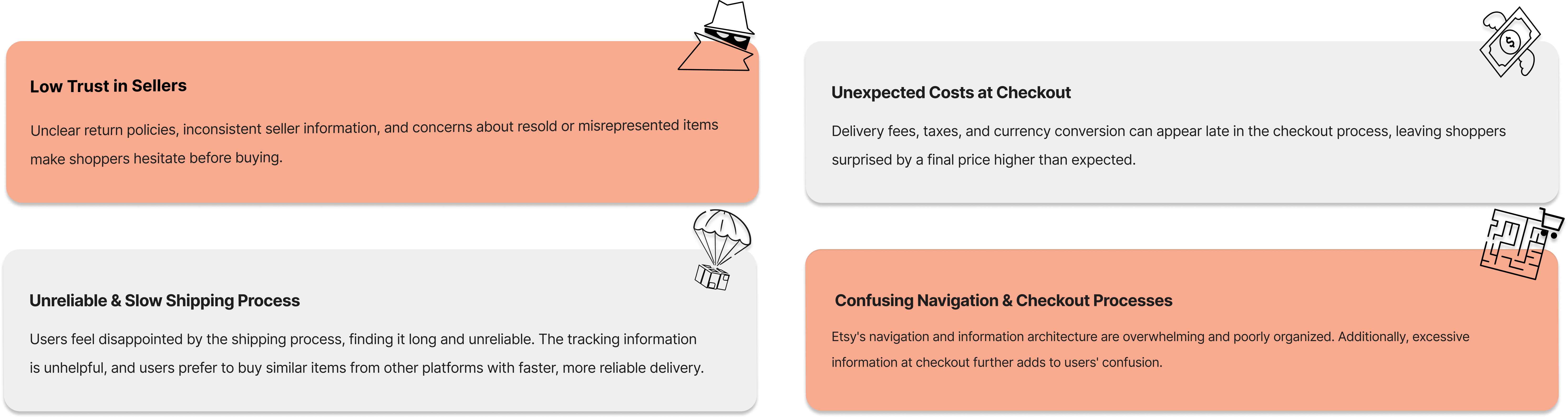
I reviewed Baymard's checkout research for the broader e-commerce context, then analyzed user feedback across Reddit, Google Play, the App Store, and Etsy's community forum. Hidden fees, slow delivery, weak support, and concerns about misrepresented items came up repeatedly.
I interviewed six shoppers about how they decide whether to buy. Two behaviors stood out: shoppers often messaged sellers because product pages left questions unanswered, and some abandoned their carts to compare the same item on Amazon or AliExpress.
I developed three shopper archetypes from the research (budget-conscious, window, and frequent shoppers) and mapped one shopper's journey from browsing to abandonment to identify where confidence broke down.
I compared Amazon, eBay, AliExpress, Bonanza, and Uncommon Goods across price transparency, seller information, shipping clarity, returns, and checkout flow. I then used HMW sessions and an impact-effort matrix to narrow the opportunities and prioritize the strongest ideas.
I designed the product page and five features in high fidelity, then tested the experience with five users to see whether the new information was clear, useful, and actionable.
A restructured product page plus four new trust and transparency features, each designed end to end.
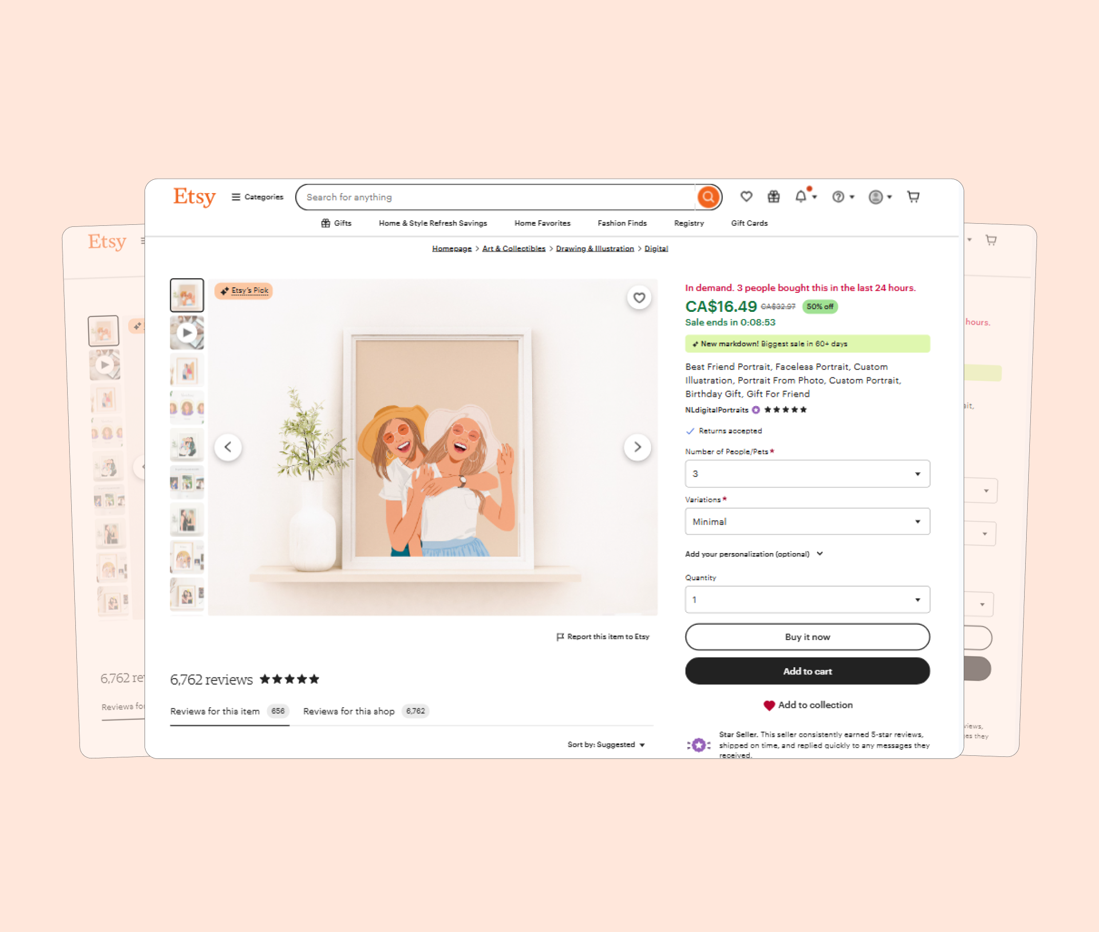
Delivery fees, return policy, and arrival dates now sit directly below the price.
Flags stock imagery and misrepresentation with a confidence score and its reasons.
Distills hundreds of reviews into the pattern on quality, delivery, and service.
Free delivery and returns: monthly or annual, pausable instead of cancelled.
An AR preview shows how an item looks in your own space first.
A restructured product page and five new features, taken from research through testing.
1
product page
restructured
5
new features
designed end to end
5
users in
usability testing
The unexpected finding
Giving the AI review summary a character and a name made it noticeably more visible, and more likely to be used.
That finding changed how I presented the feature in the final design.
Three things this project changed about how I approach design.
Shoppers weren't upset by the fees; they were upset by the surprise. Showing the full cost earlier reduced uncertainty and built confidence.
Shoppers judged Etsy against Amazon and AliExpress on price clarity and delivery, not just product quality.
The AI review summary performed better once it had a clear identity instead of reading as a generic feature.
Check out what else I've worked on