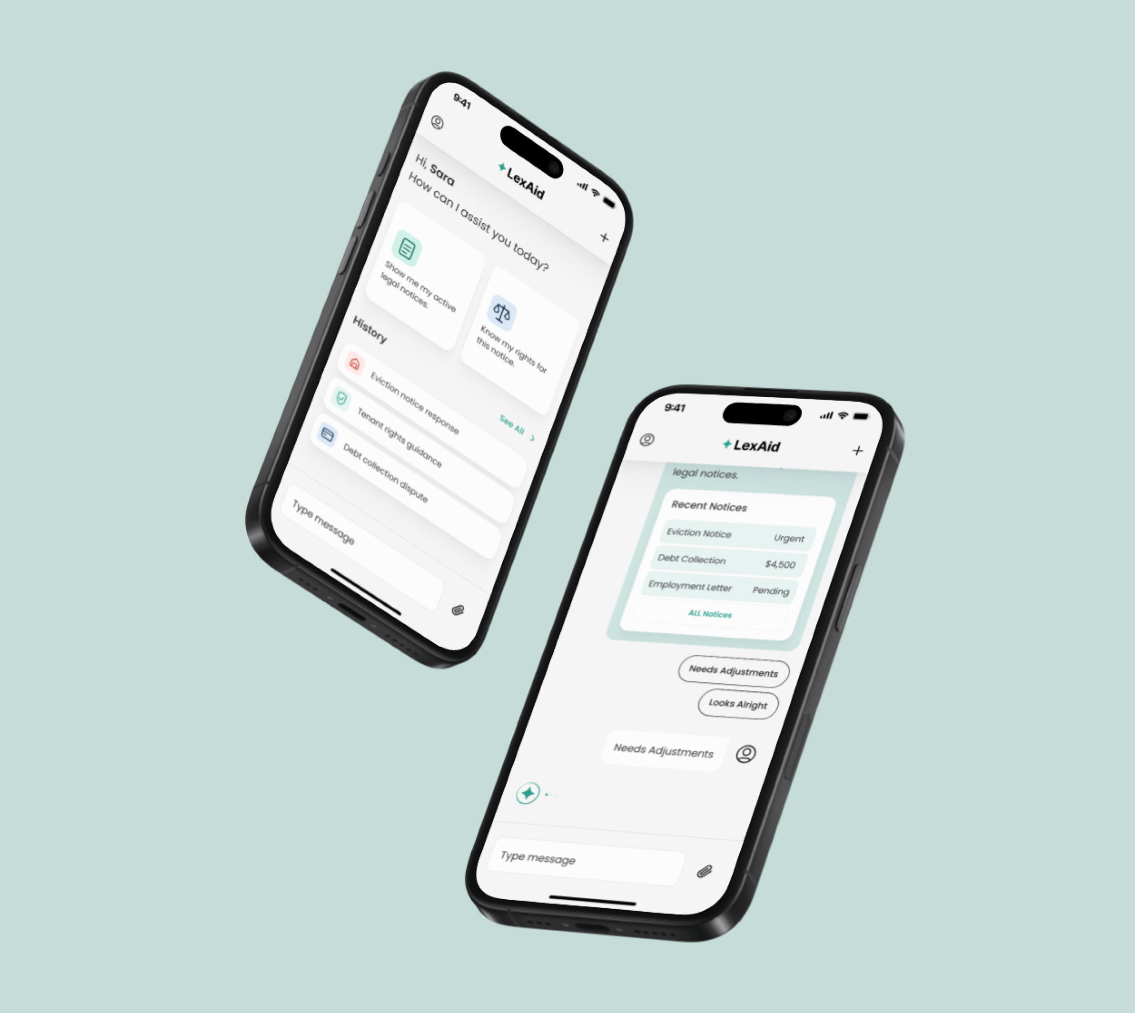
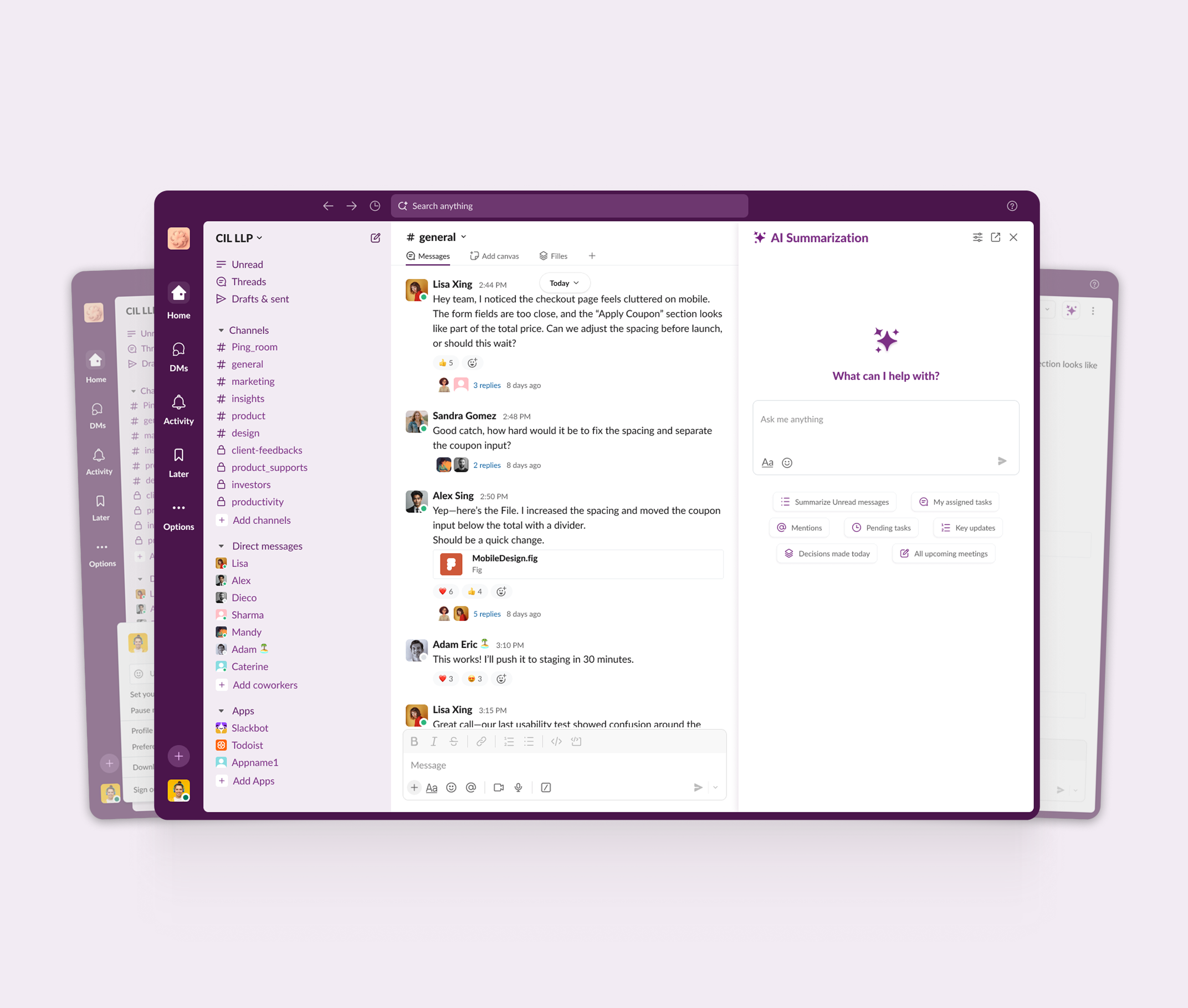
Optimizing efficiency and communication in Slack through AI-driven channel summarization and notification management
Role
Product Designer
Team
3 Designers
Tools
Figma, FigJam, Notion
Duration
5 Weeks
A few months after this project, Slack shipped AI channel summaries and comparable notification controls. I had identified the right problems and proposed the right direction.
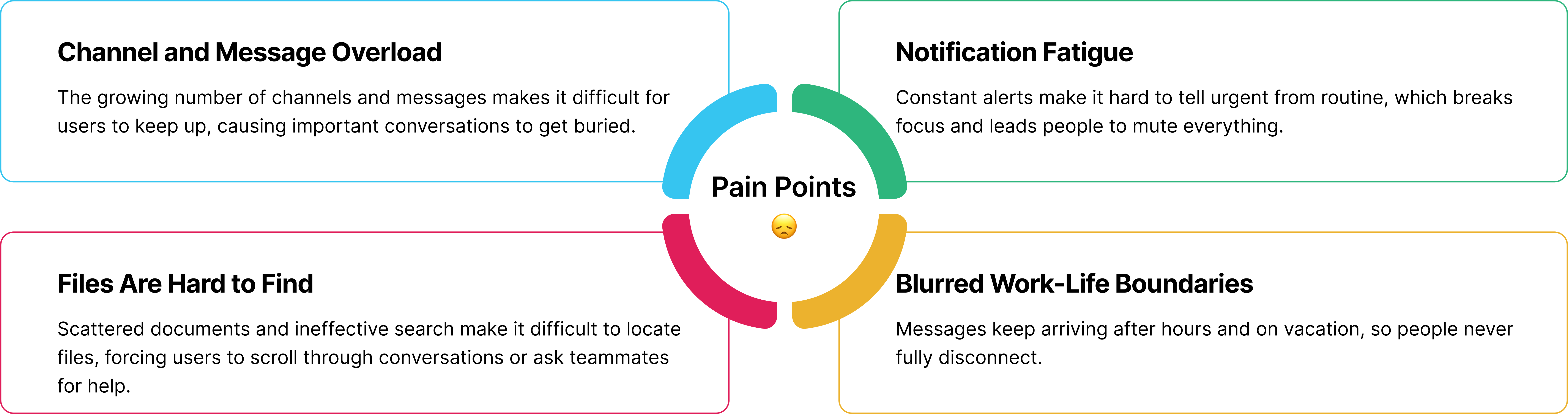
Four pain points came out of desk research across Reddit, Google Play, the App Store, and Slack's community forum, then held up in six user interviews. The research also revealed that one initial assumption did not match users' actual experiences.
AI summarization, smart search, customized notifications, and scheduled messaging, each brought to high fidelity and refined through two rounds of usability testing.
Background
Slack connects millions of teams, but the features that keep people connected also bury them. Users deal with constant notifications, channels they cannot keep up with, files they cannot find, and messages that arrive long after they have logged off.
Goal
Design AI-powered communication tools that help teams stay focused, find information faster, and maintain healthier work-life boundaries.
My Role
I owned the research and the design end to end, working alongside one other designer over five weeks. I ran the desk research and interviews, built the archetypes and journey map, designed the four features in high fidelity, and led both rounds of usability testing.
How might we reduce information overload in Slack without compromising productivity or work-life balance?
I started from my own experience as a Slack user and wrote down what I believed was slowing people down, so I had something specific to test rather than a general hunch.
I analyzed user feedback across Reddit, Google Play, the App Store, and Slack's community forum. Four assumptions were confirmed: channel overload, notification fatigue, file management, and blurred boundaries. One, onboarding gaps, was not supported, so I cut it from scope.
I ran six remote interviews to understand how these problems show up in a real workday. Participants described the same pattern repeatedly. Staying available meant constant interruption, and protecting focus meant missing things that mattered. Neither option was working for them.
I built two archetypes, a product manager and a junior developer, then mapped their journey across awareness, onboarding, team communication, and file management. A storyboard followed one archetype through a week to show where the friction actually lands.
I ran a comparative analysis of Microsoft Teams, Discord, and Telegram to see how other tools handle group communication, plus Notion and Trello for organization patterns. HMW sessions generated the ideas, and an impact and effort matrix narrowed them to four high-impact features.
I designed the four features in high fidelity, then ran two rounds of usability testing with six participants. Three changes came directly out of that testing.
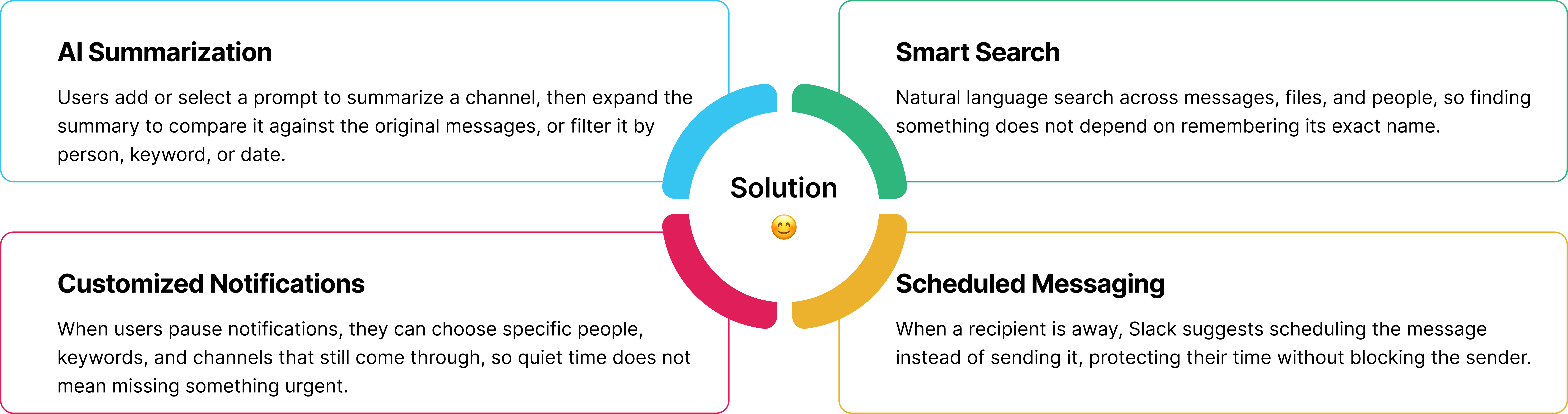
Four end-to-end features designed in high fidelity, each addressing one of the validated pain points.
Challenge 01
Every user I spoke with had muted Slack at some point, and every one had a story about the downside. One missed an urgent meeting the one time she stepped away. Slack's all-or-nothing notification control made protecting focus feel risky.
Instead of designing a better on/off switch, I designed exceptions. Users can choose specific people, keywords, and channels that can break through a pause, so protecting focus feels safer because important messages still get through.
Challenge 02
I started the project with two other designers, but partway through, both stepped away after we struggled to translate the broad problem space into a clear design direction. I was left with validated research, two archetypes, and a defined scope.
I brought in two designers I had worked with before and reset how we worked together: dividing work around each person's strengths, breaking the project into smaller goals, and holding regular working sessions where we shared screens and talked through our reasoning. We surfaced uncertainty early and finished the project together.
Challenge 03
In the first round of testing, participants lost track of which channel they were reading, and could not immediately tell where the summary ended and the original conversation began.
I moved the channel name to the top of the summary panel, added a subtle shadow to separate the two surfaces, and placed the summary and original messages side by side. The Schedule Message button moved to the right of the prompt, where users expected the primary action.
The final concept came together as a complete, high-fidelity experience.
4
features designed
end to end
2
user archetypes
guiding the work
2
rounds of
usability testing
A few months later
Slack shipped AI-powered summarization and notification controls of its own.
Reinforcing that the problems identified in this project were aligned with real product needs: the right problems, and the right direction.
Slack's depth is what makes it powerful, but it is also what can make it overwhelming. Every feature I introduced had to earn its place within an already crowded interface, which meant building on familiar patterns rather than adding unnecessary layers.
People shouldn't have to rely on personal discipline to disconnect from work. Scheduled messaging and notification exceptions came from treating people's time as a product consideration.
Letting go of the onboarding assumption when the research did not support it was just as valuable as validating the other problems. It kept the project focused on needs I could actually demonstrate, rather than designing around assumptions.